Research Report · Calo · Q4 2024
Usability Testing Report
The impact of complex experiences on first-time users.

About
About This Report
This report was created by the product design team at Calo and is intended for internal use only. The goal is to understand the challenges first-time users encounter while onboarding and identify areas that need improvement.
As part of this exercise, we explored problems in the current app using an iterative design process to develop and validate solutions. This report highlights problems found in the control version (live Arabic app V.3.120.0) and shares design recommendations, all of which have been tested and validated.
Disclaimer
This process involved a qualitative test. To fully conclude the study, we will collaborate with the product team to run live experiments based on the recommendations and gather quantitative feedback.

Through the iterative design process, we gained a better understanding of problems and improved recommendations through multiple testing cycles.
Personas
Who We Tested
We focused on potential customers representing first-time users of Calo to validate whether the app can attract and retain new customers.
Persona 1
Age
35–40
Income
>25k SAR/AED
Goal
Eat healthy
Experience
Never used Calo
Persona 2
Age
20–25
Income
>15k SAR/AED
Goal
Build muscle
Experience
Never used Calo, but similar apps
Persona 3
Age
25–35
Income
>20k SAR/AED
Goal
Lose weight
Experience
Never used Calo, but similar services
Scope
Scope of Test
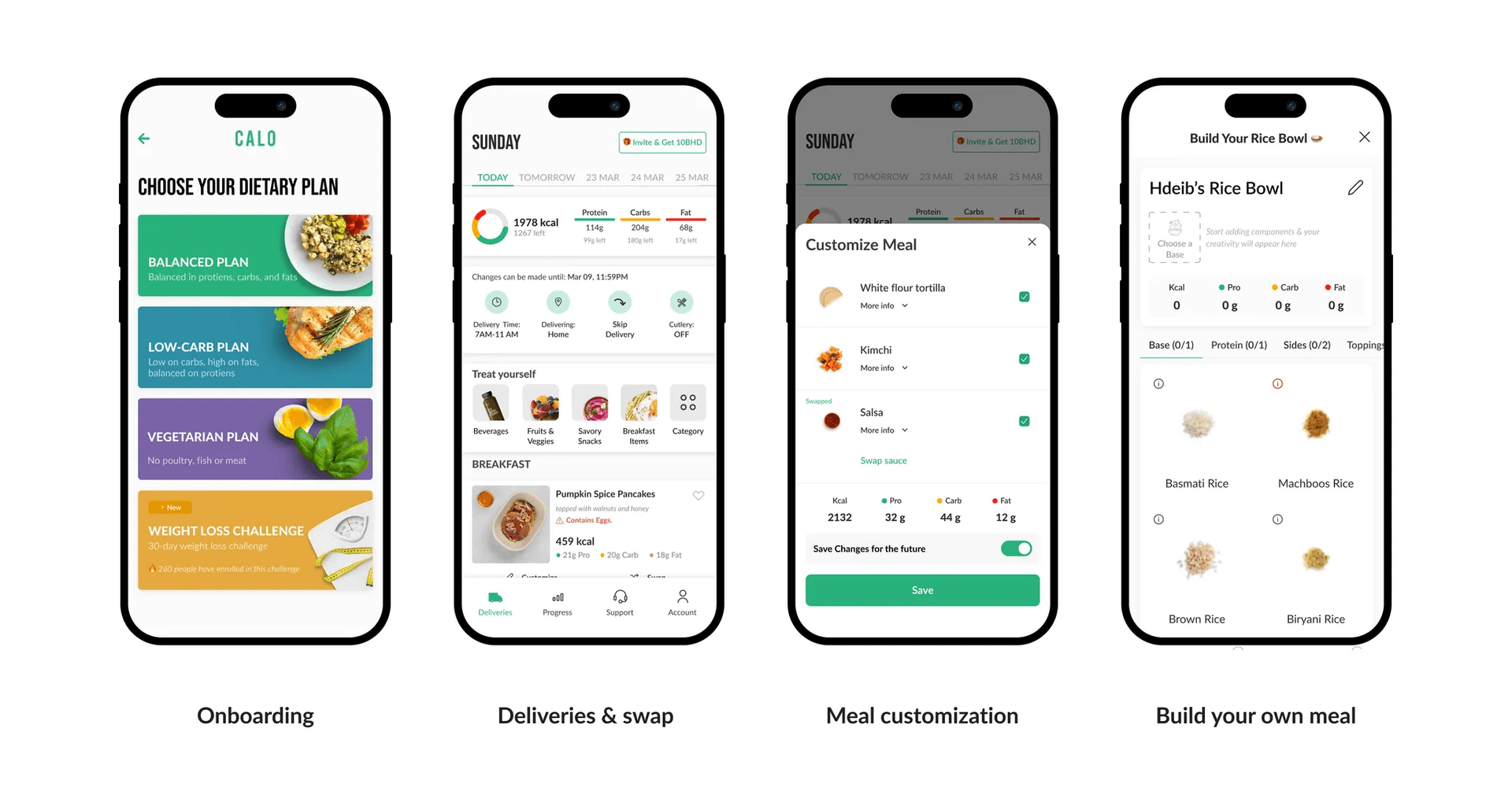
During the test, we focused on the key user flows that shape a first-time customer's experience, including onboarding, meal swapping, customization, and Build Your Own. Tests also covered add-ons, macros bar, date picker, skip-delivery, and more.
Part 01
Onboarding
Highlight: A single, focused screen with one clear action leads to higher success than screens with multiple options.
TL;DR: Users often missed important details that were grouped together. Frequency days and delivery time shown together caused confusion. The dietary plan contained so much information users were uncertain. Food images led users to believe they could choose those items for their first delivery.
Conclusion: The simpler we make the information and required actions, the more successful the experience becomes.
1. Landing Screen

Issues
- 1Most users did not notice the carousel.
- 2The background video distracted users from reading the text or noticing the slider indicator.
Insights
- ✦A simpler screen can help users move on to the next step more smoothly. While the video conveys brand values, it may divert attention from key information.
Issue
Type
The OTP failed twice for some users.
Bug
First-time user received a prompt to join Calo Club.
Logic
First-time user also saw a prompt to join Custom Macros.
Logic
A CX prompt appeared in English despite the user's experience being in Arabic.
Configuration
The calendar was displayed in English on an Arabic device.
Bug
Recommendations
Landing & Registration
Design Changes
- +Simplified the message
- +Simplified the graphics
- −Removed the toggle between Sign In and Sign Up
- −Removed video & carousel
Hypothesis
By simplifying the login screen and removing clutter, we can lower drop-off and reduce errors at this stage.
Metrics to Track
- 1.Step conversion
- 2.Drop off
- 3.Error Rate
Allergens
Design Changes
- +Added an allergen question screen
- −Removed the vegetarian toggle
- −Removed progress bar across onboarding
Hypothesis
By asking users directly if they have allergies, they are more likely to respond accurately. This allows them to skip the allergens screen if they have none.
Metrics to Track
- 1.Allergen Rate Reduction
Dietary Plan
Design Changes
- +Added Macros information on the card
- −Removed unnecessary visuals
- −Removed menu items
- −Removed promotional dietary plans (Chef's Picks)
Hypothesis
By displaying macros on the dietary screen and removing menu items and promotional plans, we expect an increase in step conversion rates.
Metrics to Track
- 1.Step conversion
- 2.Plan conversion rate
Menu Preview
Design Changes
- +Introduced a new menu screen
Hypothesis
By introducing a new menu screen, we can better showcase our offerings and capture users' preferences for the algorithm, boosting conversion rates.
Metrics to Track
- 1.Conversion rate
- 2.First delivery NPS
- 3.First week meal rating
Subscription Days
Design Changes
- +Decoupled Frequency
- +Decoupled First Delivery Date
- +Decoupled Delivery Time
- +Added Delivery Instructions
- −Removed 'Skip' Information
Hypothesis
By separating each screen, we reduce errors when choosing the wrong date or delivery time and increase the likelihood of 3-month subscriptions.
Metrics to Track
- 1.Quarterly subscription
- 2.Step conversion
Welcome Email
Design Changes
- +Introduce a welcome email covering key features: swipe, skip, BYO, customization
Hypothesis
By sending an onboarding email with all necessary information for a successful first delivery, users are less likely to miss key features.
Metrics to Track
- 1.Skip-related CX tickets
- 2.Increase of BYO items
Part 02
Swap Experience
Highlight:Images of food grab users' attention so strongly that they overlook highly visible elements like the macros bar.
TL;DR:When users arrive at the first delivery screen, most focus on food images first. When asked how to swap a meal, some assumed the 'Treat Yourself' section was the menu. Users tend to ignore the macros bar at the top, expecting it at the bottom as the 'total' for the day.
Conclusion: We rearranged the screen based on these observations and adopted an 'images first' approach.
1. Deliveries Screen
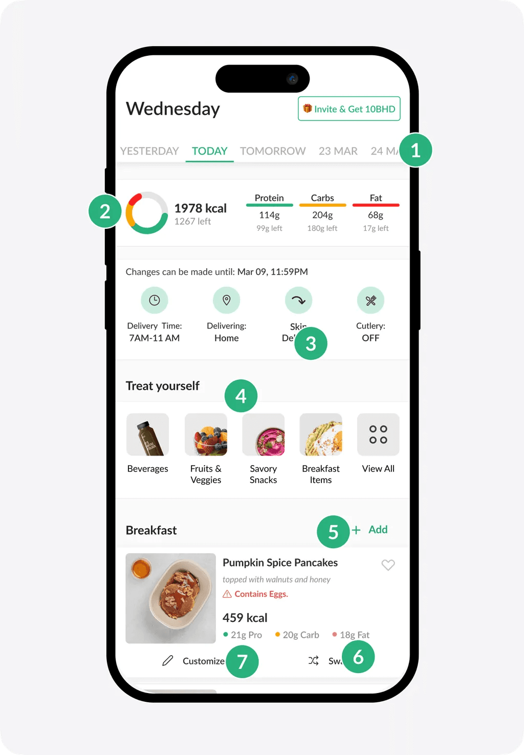
Issues
- 1Some users were confused about why the delivery date was set two days ahead.
- 2Most users didn't notice the macros bar at all.
- 3All users didn't understand how the skip function works.
- 4Some users assumed 'Treat Yourself' was where they could swap meals.
- 5Some users believed 'Add Meal' was how they could swap.
- 6Some users thought swapping would cost extra.
- 7One user believed 'Customization' was the method for swapping meals.
Insights
- ✦Everyone ignored the meal description.
- ✦Users who missed frequency screens during onboarding felt confused about their first and weekend deliveries.
- ✦All users overlooked both the delivery card and the macros bar because food images dominated their attention.
- ✦Users expected to see the same items they saw during onboarding.
Issue
Type
An English Intercom message appeared when the user tried to select a meal.
Configuration
The wrong meal was swapped after the user selected it.
Bug
When the user clicked on one meal to swap, the meal above it was swapped instead.
Bug
The user landed on the deliveries screen for the first time and saw a 'Subscription ended' message.
Bug
Tapping 'skip' multiple times caused the entire week to be skipped.
Bug
Recommendations
Deliveries Screen
Design Changes
- +Added days and dates
- +Moved add-ons to the bottom
- +Highlighted the swap button
- −Removed meal description
- −Removed invitation tag
- −Removed macros chart
- −Removed cutlery
Hypothesis
By simplifying the delivery screen and reorganizing components where users expect them, we anticipate a higher success rate and lower error rate for first-time users.
Metrics to Track
- 1.Swap rate
- 2.Add-ons CTR
Swap Screen
Design Changes
- +Increased emphasis on images
- +Greater focus on macros
- +Added the selected meal at the top
- +Enabled navigation between meals
- +Enabled navigation between days
- −Removed filters
- −Removed Dietary Plan tabs
Hypothesis
By emphasizing images and introducing new navigation elements, users can quickly swap meals for the entire week, increasing their perception of variety.
Metrics to Track
- 1.Swap rate
- 2.Time to swap
Part 03
Meal Component Customization
Highlight:Users expect to personalize their meal directly within the meal details page, rather than through a separate 'Customize' button.
TL;DR:Users often tap on an image to view meal details, then scroll to the components section to remove anything they don't like. In the current setup, users can find the 'Customize' button both on the delivery screen and inside meal details.
Conclusion: We removed the 'Customize' button. Now users can edit meal components before and after swapping directly from meal details.
1. Deliveries Screen

Issues
- 1Most users tapped on card details to access customization. Some found the button there, others missed it and returned to the deliveries screen.
Insights
- ✦Users expect to customize meal components directly from the meal details page.
Recommendations
Design Changes
- +Grouped 'Customize Meal' with meal details
- +Rearranged information in the meal details section
- +'Save Changes' now appears once the user finishes making updates
- +Allow users to customize their meal before swapping it
- −Removed the 'Customize' button
Hypothesis
By placing the 'Customize' feature within the meal details page, users will have no trouble finding it. This also simplifies the Deliveries page further.
Metrics to Track
- 1.Customization rate
Part 04
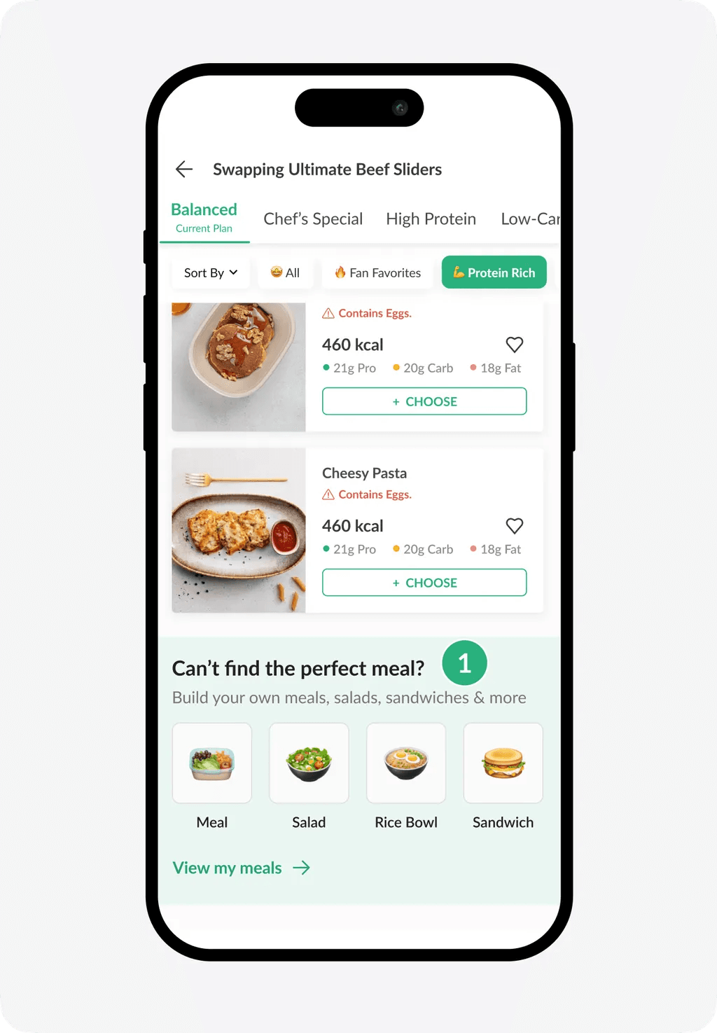
Build Your Meal
Highlight: The BYO feature has very low visibility. Placed among food images, it often goes unnoticed, and users do not expect to find it there.
TL;DR: Users had trouble finding the BYO feature; one user encountered a bug that hid it entirely. Once discovered, it was hard to figure out how to add single or multiple components, making the overall BYO experience confusing.
Conclusion: We introduced a simpler, gamified version of BYO that shows users how their meal is being built as they add components.
1. Swap Screen (BYO Entry)
Issues
- 1Users did not notice the Build Your Own (BYO) section and simply scrolled past it.
Insights
- ✦Users don't expect to build their own meal if they don't like any of the listed meals.
- ✦The BYO section was easily overlooked because food images drew most of the users' attention.
Issue
Type
When users scroll and then move to the next component, the screen retains the previous scroll position.
Bug
Image didn't update once the user built a meal, which led to confusion.
Bug
One user was unable to see the BYO section because it was hidden from the swap screen.
Bug
Recommendations
BYO Entry Point
Design Changes
- +Introduce animated video for BYO access point in the swap screen
- +Add a new bottom sheet for selecting meal type
Hypothesis
By using an animated image/video instead of emojis, we expect users to pay more attention to the BYO section, leading to higher adoption.
Metrics to Track
- 1.BYO CTR
BYO Flow
Design Changes
- +Added a sliding component to guide the user through the experience
- +Introduced real-time imagery that updates as the user builds a meal
- +Simplified navigation to reduce confusion
- −Removed dish naming option
- −Removed dish description option
Hypothesis
By creating a more engaging experience, we expect to reduce drop-off for BYO and increase its overall adoption.
Metrics to Track
- 1.BYO adoption
- 2.BYO drop-off
Conclusion
Key Takeaways
Users gravitate toward simplicity, clarity, and intuitive design when navigating screens. Overly complex layouts and competing elements can overwhelm users and cause them to miss important details like meal descriptions, macros, or delivery information.
Sign-up processes should offer familiar methods like phone number options. Customization options need to be more prominent, as users expect intuitive ways to personalize meals or compare plans based on calories or macros.
Users' decisions are heavily influenced by images, with less appealing visuals being ignored. Clear prompts and streamlined workflows can help guide users effectively, ensuring they feel engaged and confident throughout their journey.
Team
Contributors

Maulana Farhan
Product Designer

Sabreen Bucheeri
Product Design Manager

Omar Aly
Head of Design
Product Design team @ Calo · Q4, 2024
© 2024 Farhan